PRODUCT LAUNCHED
🎉 The design was handed off to the Dev team in December 2022 and was launched in the second quarter of 2023.
Click on the Sanofi page for My Dose Coach.
🎉 The design was handed off to the Dev team in December 2022 and was launched in the second quarter of 2023.
Click on the Sanofi page for My Dose Coach.
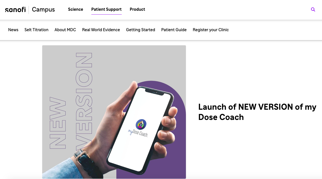
Introduction to My Dose Coach at Sanofi
UX Designer
(Team of two)
2023
12 weeks
Figma
Miroboard
My Dose Coach™ is an innovative application tailored for adults with type 2 diabetes, facilitating the management of daily long-acting basal insulin doses. This empowers patients to monitor their fasting blood glucose levels accurately and adjust their insulin doses according to the plan set by their healthcare provider, aiming for their target glucose level.
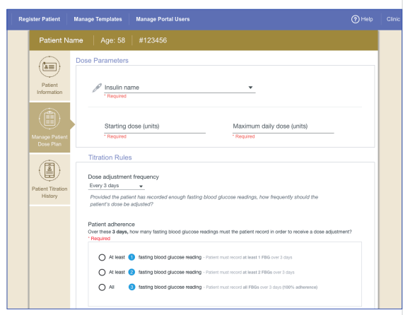
Our redesign focuses on the healthcare providers' platform, where critical patient data from the My Dose Coach™ app is centralized.
Enhance the platform's interface, making the data transfer more intuitive and the information more accessible, thereby streamlining the decision-making process for healthcare professionals.
Improve My Dose Coach health care provider (HCP) Portal experience - to gauge the ability to increase participation of HCPs in the program.
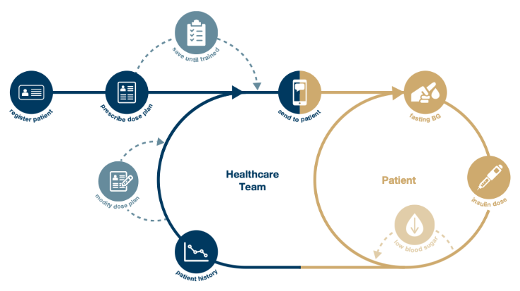
Firstly, we need to understand how the data was transferred from the My Dose App to the HCP Portal, so we draw the below chart to understand the whole process from the user interaction with the app and the open window from them to enter the data to be transferred into the HCP portal.
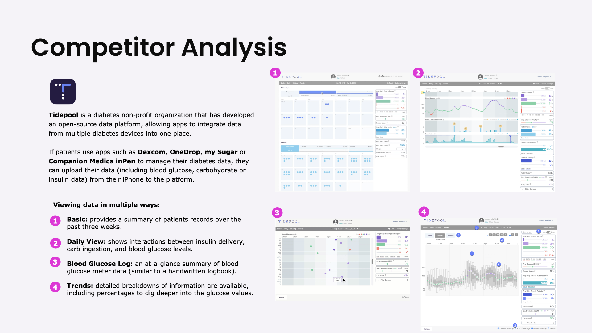
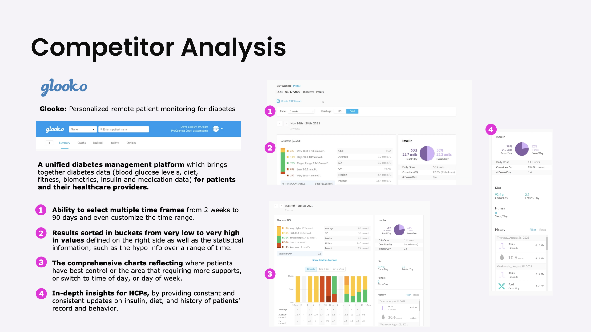
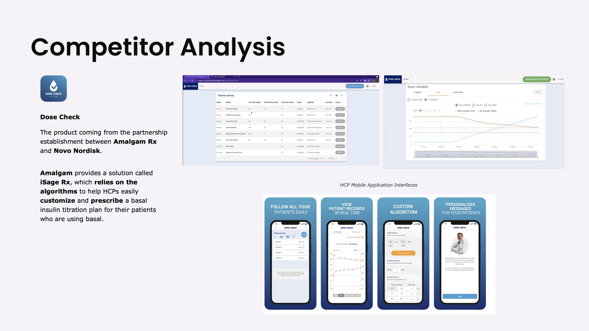
In examining competitors' landscape, it's crucial to understand their features and offerings. We gain insights into industry trends and user expectations by delving into their offerings.
Below is the Competitor analysis:

After a comprehensive analysis of our current design, we have identified below opportunities to drive the design. We aim to enhance user experience and empower healthcare providers (HCPs) with efficient tools for managing patient records and making informed decisions.
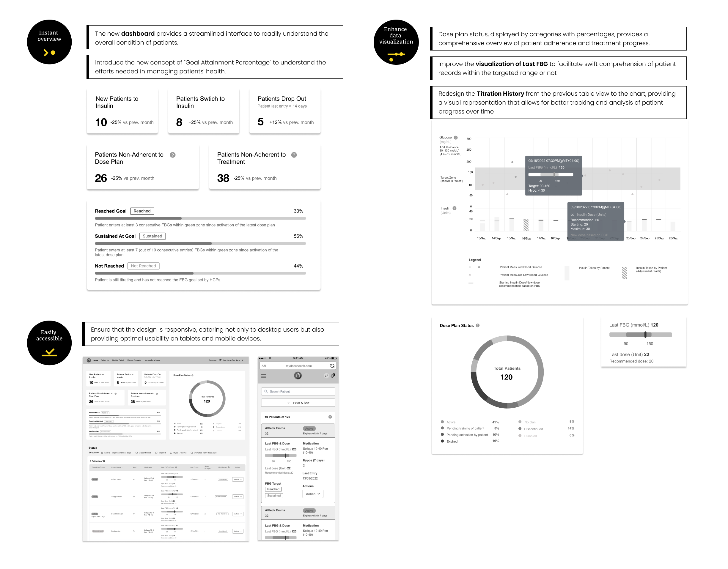
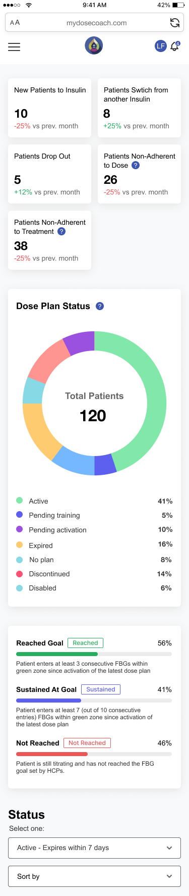
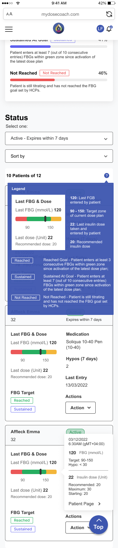
The flexible and intuitive end-to-end user journeys in multiple devices, with easily accessible key information and simple smart tools & tips to dig deep into the values of patients' records and history.
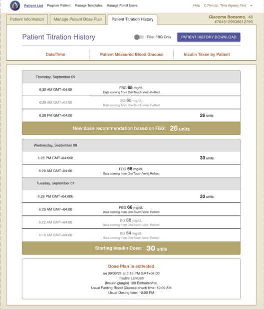
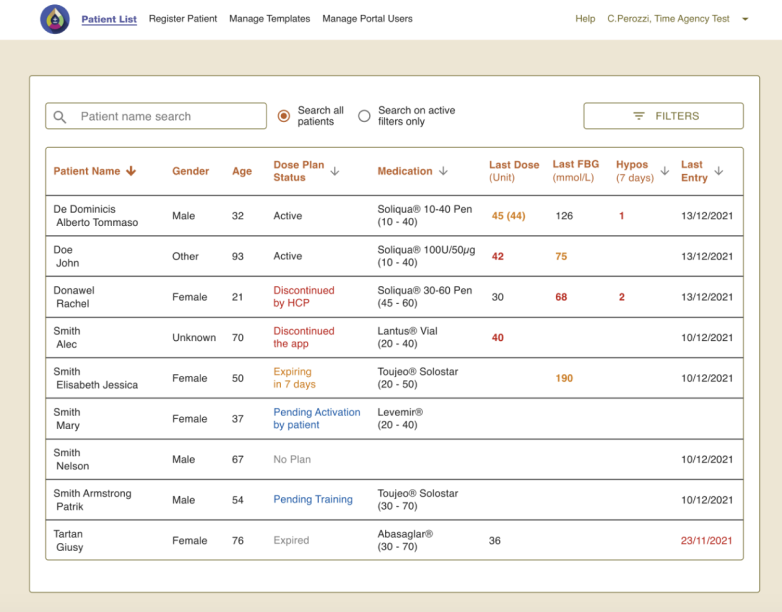
Each patient record should be in detail, yet comprehensive and easily followed with visually enhanced presentations, such as graphs and charts in color.

Consolidate and visualize all data in instant overviews, enabling our HCPs to make quick, informed decisions.
Below are several enhancements compared to the previous design, addressing the pain points of our HCPs and issues on the current platform. These improvements signify a significant stride in usability and functionality, poised to streamline workflows and elevate user satisfaction.